

Looking to add a pop of colour to your home? Curious what type of projects you can do with spray paint? How about prepping your walls before painting? Visit our Paint Tips section online for helpful painting advice.


Looking to add a pop of colour to your home? Curious what type of projects you can do with spray paint? How about prepping your walls before painting? Visit our Paint Tips section online for helpful painting advice.

Beige or standard white are usual paint colour recommendations to homeowners wanting to avoid making their home look small, dark or chaotic. They naturally want their home to look large, bright and calming.
Pops of colour can make a room vibrant and attractive, so here are five easy TIMBER MART ways to infuse a bit of colour into your space …
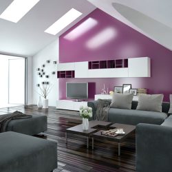
Painting all four walls a vibrant shade of orange isn’t usually the best call, but sometimes you succumb to a bright paint swatch and it’s hard to resist. That’s why accents walls are great, you get all of the fun of choosing a daring and exciting colour without the cold-sweat panic of realizing it’s suddenly on all of the walls.
An accent wall looks great paired with a gallery-style arrangement, built-in bookcase or special details. A different, very modern take on the accent wall is to tape off an angled section and simply paint half of the wall, leaving the other half white.

Fireplaces, half walls, doors, trim, archways, even arbitrary skinny walls at the end of a hallway? All unique details that could be accentuated with a pop of colour. Everyone thinks about painting their front door but what about the door to your pantry or the door to your bedroom closet? This is a perfect spot for a splash of kelly green, fuchsia or tangerine.
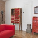
With the right prep-work and variety of paint, it’s never been easier to change the colour of a hutch, dresser, coffee table or entertainment unit. Most furniture comes in neutral tones to target the masses, not because they look best in white, beige, tan or shades of wood.
Shake up your dining room by pairing beige walls and white wainscoting with a spectacular royal blue table. Refresh a dated bedroom by painting your nightstands a really fantastic shade of green. Unlimited options!
Who says lighting fixtures need to be brushed nickel or oil-rubbed bronze? Take some sunshine-yellow paint to the old chandelier you inherited from the previous homeowners. Don’t forget about cabinets, vanities and other built-in pieces that could use a brightening-up.
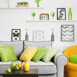
Don’t despair if the idea of fearlessly splashing a wall or large piece of furniture with bright colour is too ambitious for you. Pops of colour can be as small as the accessories in a space, like vases, photo frames, tchotchkes, sculpture, paintings, storage bins or floating shelves. Start where you feel comfortable and enjoy the happy little hits of colour.
Inspired to run out and buy a rainbow of pop colours? We’re here if you have any questions.
Are you a football fan? Or know someone who is? Check out how this Dad added team spirit to this side table with Krylon.
https://www.youtube.com/watch?v=huxNGQBW-e4&feature=youtu.be
Tiffany Pratt is a designer and creative on HGTV and the author of This Can Be Beautiful. She is widely known as a designer who pours herself into every project with intense passion, while her trademark hair and endless energy make her unforgettable. So, it was a no brainer for Krylon to partner with the colour queen to create fun and creative DIY’s that show how easy it is to bring colour into your home. Now, Tiffany has cultivated her own line of her favourite Krylon colours which she uses in her colourful and exciting projects. She has collaborated with Krylon to bring you fun and easy DIY’s that will add a pop of colour into your life and home. She has carefully selected her favourite Krylon colours that she uses in these DIY projects to showcase her new Trends Collection.


Make sure your piece is clean, dull and dry before you start painting. Spray painting on a dirty surface could cause problems down the road. For your safety, spray paint in a well-ventilated space, ideally outside, and wear a mask.
The most important part! Pick the colours you want to combine to create your ombré gradient. You will need at least one light colour and one dark colour. If you’re up for a multi-coloured piece, it could be fun to mix in a different sheen like Krylon Shimmer Metallic. Most importantly, pick colours that inspire you and make you happy.
Start with the light colour first. You can start from the top or the bottom. Apply with light, thin coats in a sweeping motion from side to side. Make sure you read the instructions on the can to ensure you’re using the proper spray distance.
Once you’re happy with the coverage of the light colour, start painting from the opposite end with the dark colour. As you get towards the centre of the piece, you’ll notice the colours begin to overlap. Embrace it! This is where the magic happens.
When you’re happy with your coverage of the dark and light bases, start to play around with layering the middle. Light, short bursts are best to ensure a smooth, even blend that will make that ombré gradient pop. Don’t hold the can too close to the piece or the colour will be too concentrated. If you’re adding in additional colours, continue to layer each colour, bleeding one into the other as outlined above – short, light bursts – until all colours seamlessly blend together from the top to the bottom.
Once you’re happy with the look, set your piece aside to dry. Make sure you place this piece in a prominent location. A beautiful ombré DIY deserves the spotlight!!
Painting an ombré gradient is much easier than it looks and sounds. The key is to embrace the process and embrace the overspray. Keep playing around with your layering until you’re happy with the result. There’s no right or wrong way to do this –it’s all about having fun, playing with colour and embracing your creative side!
