When you have an overall colour palette, the rooms flow together and there’s a sense of whole-home harmony. Don’t worry – that definitely doesn’t mean all of the rooms will look the same.
Here at TIMBER MART we know a few things about picking colour palettes, but it really comes down to what you and your family like. After all, it’s your home.
Start by thinking about what you like – and dislike – in other people’s homes. When you visit a friend with deep navy walls in their living room, do you compliment them on the bold choice or cringe at the thought of having something so dark on your own walls?
Once you have an idea of what you like, it’s easy to put together a personalized palette. Here are a few ideas to get you started…
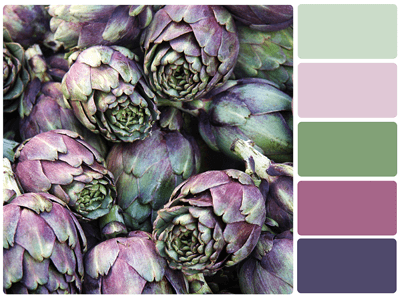
If you like soft, pretty shades
Soft shades of blue, yellow, violet, green, and coral are beautiful, but combining two in a single room many will make your home look like something out of a fairytale. Give each room its own soft tone and then add lots of neutrals, like white and grey.
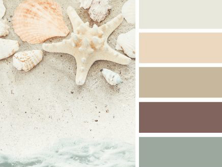
If you like a relaxed, beachy vibe
It’s easy to get carried away with blues and greens with this palette, but you don’t want your home to feel like walking through rooms at an aquarium. Maintain a balance by adding in lots of soft creams, browns, whites, and wheaty tans.
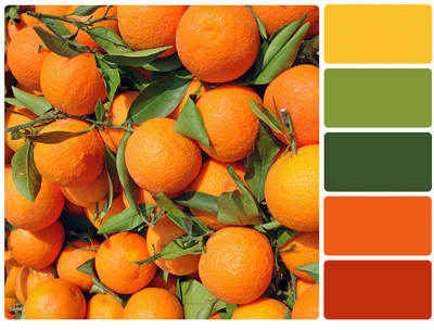
If you like bold, saturated colours
People who aren’t afraid of powerful colours tend to love deep teal, red, orange, and charcoal shades. If you opt for a brazen, spicy palette for your home, be sure to mix in warm neutrals so those dramatic colours aren’t competing.
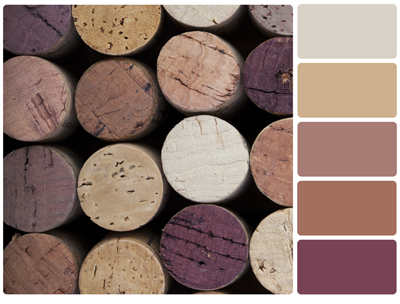
If you like colour but not too much colour
Try a mix of muted shades, like greyed-out plums, blues, and browns. Because the colours aren’t as saturated, they have a calming, romantic effect.
If you’re really nervous about colour
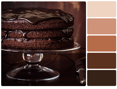
Neutrals are great, but make sure there’s more than just cream and taupe or else your home will be as exciting as a bowl of unsweetened applesauce. Embrace shades of beige, khaki, and tan if that’s what you love, but work in subtle colours – or the occasional bold shade, like navy, deep red, or chocolate – to perk things up.
***
Happy colour-choosing!


