


PPG’s Soulitude collection of neutral paint colours offer a great foundation for any room. Neutrals may seem basic, but there are so many options! So how do you choose the right neutral? There is an important question you need to ask yourself before you dive into the paint chips: should your neutral be warm, cool, light or dark?
Warm or cool?
Despite being called “neutrals”, most neutral paint colours will have undertones of other colours. For example, a cool grey might contain blue or green undertones while a warm grey will lean towards brown, orange or red. Whether you prefer a cool or warm neutral will depend on your decorating style.
Generally speaking, cooler neutrals look a bit more modern and go well with cool, fresh accents like blue. They’re great for creating a coastal vibe. Warm neutrals like beige, browns, and “greige” are inviting and comforting, pairing well with cozy colours and natural wood accents. While true greys – a mix of only pure white and black with no undertones – are certainly available, they can look a little lifeless in some rooms. True greys work best with very minimalist design schemes.
Pro tip: the best way to figure out the undertones of a colour is to look at the darkest colour in the swatch. It will contain the most pigment and be the truest representation of the hue.
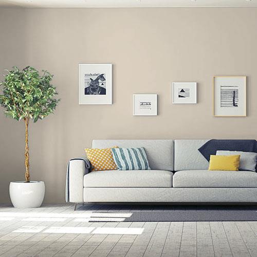
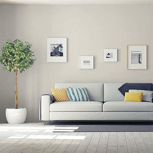
Our favourite PPG warm neutral: Synchronicity PPG1021-2
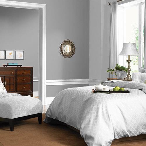

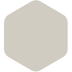
Our favourite PPG cool neutral: Flagstone PPG1001-4
Light or dark?
Do you want your space to feel bright and airy or dark and bold? Whether light or dark, the colour you choose will ultimately define the mood of the space.
Light neutrals like beiges, dove greys and off-whites can brighten spaces especially if there is not much natural light. They also provide a crisp backdrop so your furniture will be the star of the room. There’s a reason so many show-homes are painted in “builder’s beige” – when in doubt, a light neutral is always the safest choice.
That said, dark colours can make quite an impact and they don’t have to feel oppressive. When done right, they can be quite cozy and dramatic. While sometimes dark colours can make your space look smaller, they can also do the opposite by making it look like your walls go on forever. To make sure your space doesn’t feel too cave-like, contrast the dark colour on your walls with bright accents like white mouldings, ceilings and drapery. Large windows, lots of natural light and plenty of reflective and high-gloss surfaces also help dark colours to not feel too oppressive.
Our favourite PPG light neutral: Whiskers PPG1025-3

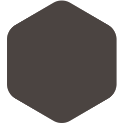
Our favourite PPG dark neutral: Phantom Mist PPG1002-7
Think you know what neutral will look best in your home? The light in every room is different so it’s always a good idea to test a sample on your walls.
***
Stop by your local TIMBER MART dealer for everything you need to complete your home painting projects!